Nasfund Brand Identity


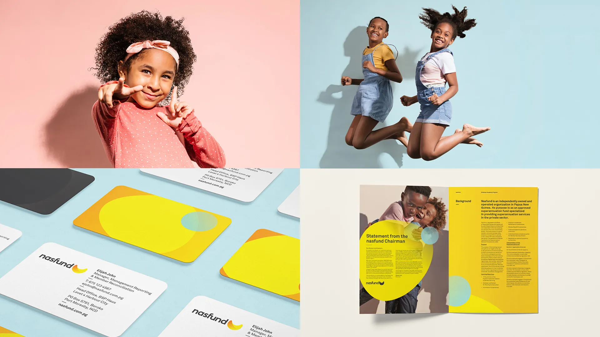
Nasfund came to us to refresh its identity and strengthen member confidence during a period of growth. We modernised the brand while keeping the trust and heritage that have defined PNG’s largest private-sector super fund for decades.
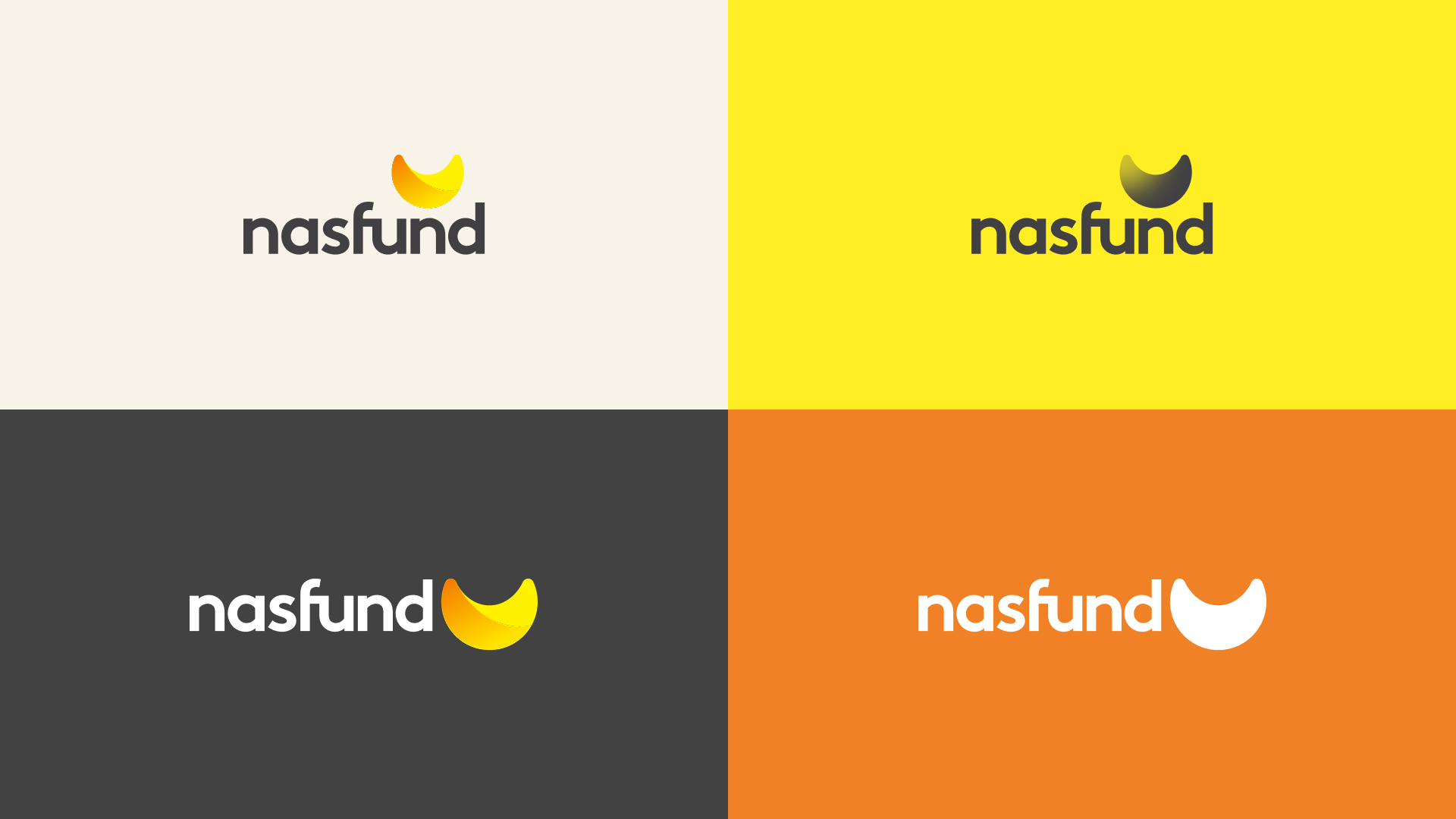
We rebuilt the kina shell mark into a simpler, more contemporary symbol that still honours PNG’s economic story. The new identity feels warm, optimistic, and recognisable, designed for everyday members, not just corporate audiences.
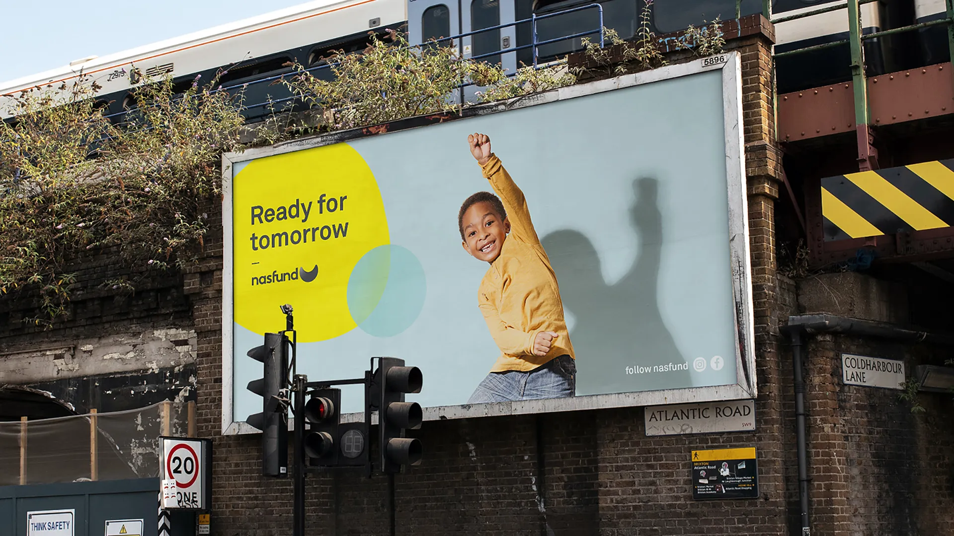
‘Ready for Tomorrow’ became the foundation of the brand system. It shaped every touchpoint, from digital tools to outdoor, positioning Nasfund as a clear, confident partner in long-term security and future planning.
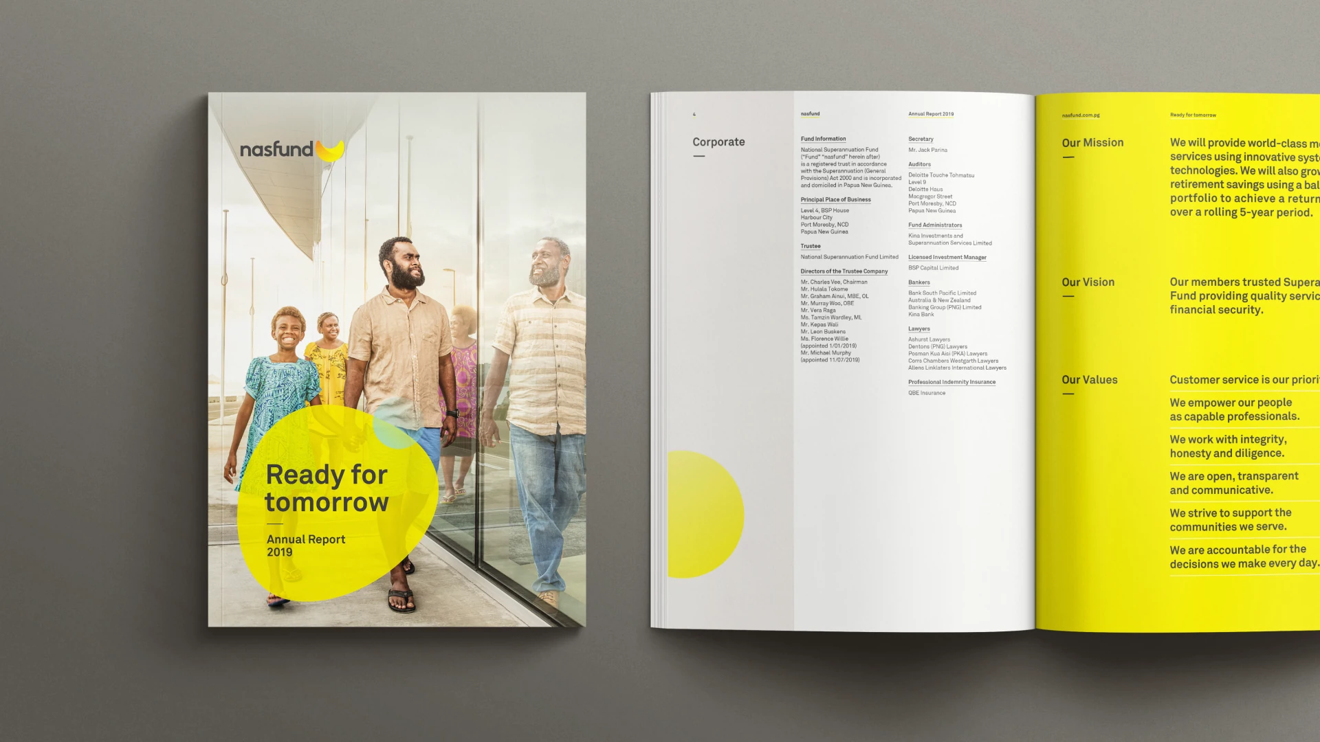
Across annual reporting and corporate communications, the identity brought a more modern, member-focused tone to the organisation. The system balanced clarity with optimism, helping Nasfund speak about financial wellbeing in a way that feels real and accessible.
Savings shape futures, families, and everyday choices. Through film, we helped Nasfund show the human side of super, reminding members that what they invest today supports the people and moments that matter most tomorrow.